August 13, 201411 yr Will look good on players. Will look ridiculous on fans, which is fine for Toronto because they don't have any.
August 13, 201411 yr They look really good. I would be stunned if these aren't the best ones. They look new but not overly ridiculous. Sure the "A" on the chest will be more problematic for viewing actual games, but the colour scheme and design is solid. At least the numbers on the back will be visible.
August 13, 201411 yr No. No. Holy F'ing S, no. The numbers even appeared to be shiny. We have two of the best looking uniforms in world sports... why Reebok would do this to us is just baffling and infuriating. At least we're not likely to wear them much (based on how little we've worn "3rd" jerseys in recent seasons). And if this is what Reebok did to us... and we have a cool, sharp logo and nice colour scheme... i'd be very nervous if I were some other teams' fans.
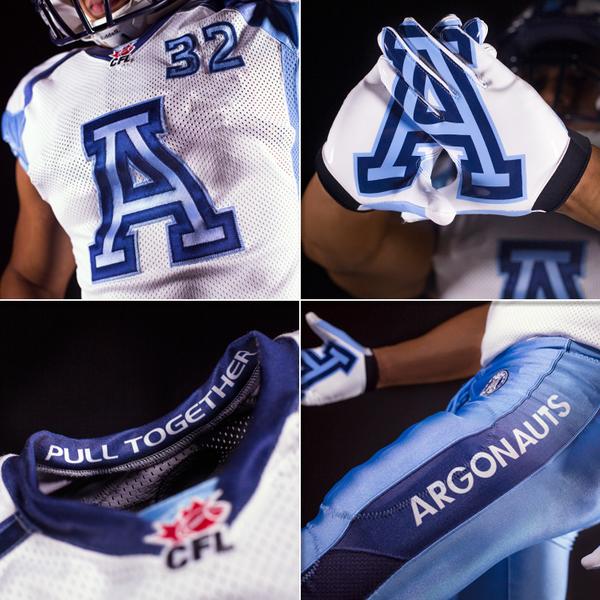
August 13, 201411 yr The jersey above was a fake. I'm certain these were the jerseys unveiled by the Argos last night.
August 14, 201411 yr Author The name bare on the shop looks ridiculous.... That name bar just looks ... amateur
August 14, 201411 yr I thought these didn't look too bad from the front, but holy crap that name bar. It looks like a pull tab. Tear it off while you're sacking Ray and you win $5!
August 14, 201411 yr The name bar looks like a really bad photoshop of some kind.. Just brutal, don't mind the Jersey there itself though. Actually, i wonder if you can peel the name bar apart and inside is a band-aid cuz that's what it actually looks like.
August 14, 201411 yr Is it just me or does the name bar cover the dark blue stripes? Like, that to me is insanely bush league.. Like mama ironed on that name bar..
August 15, 201411 yr Here's the link to the store with the horrific namebar, fyi - http://toronto-argos-store.myshopify.com/ From the release video: So I'm HOPING the jersey will not actually had that hideous bar, but why would they even put it out there??
August 15, 201411 yr Looks like the kid on the hockey team who had his dad sew the namebar on rather than his mom.
August 18, 201411 yr Those signature jerseys look a lot better on the field than the powder blue retros the Argos sported a few years ago: (also pictured is Milt Stegall, breaking the career receiving yardage record)
August 18, 201411 yr Those signature jerseys look a lot better on the field than the powder blue retros the Argos sported a few years ago: (also pictured is Milt Stegall, breaking the career receiving yardage record) It looks like milt is charming that football like a cobra... That or making it levitate in his hands..